From Google Trends there is a public interface where you can look at the most popular search queries of a country, similar to Twitter Trends. The special thing about these trends is that they are almost live. This means that you can quickly see what a country is currently doing and the data is constantly updated. You can access these trends directly in the browser.
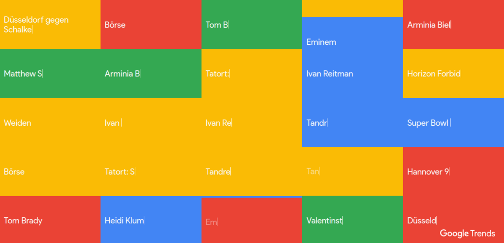
https://trends.google.com/trends/hottrends/visualize?pn=p15&nrow=5&ncol=5
An excellent source for raw data! I decided to develop an application, which simply saves the data hourly into a database.
I didn’t really know what I wanted to do with it at the time, but maybe an interesting use case would come up. I have dealt with this data a little bit and tried to visualize it somehow appropriately. In the process I also discovered another interesting work, that work can be found here. This work has used a Matplotlib extension to visualize Google Trends in a pleasant way. The library used is Seaborn.
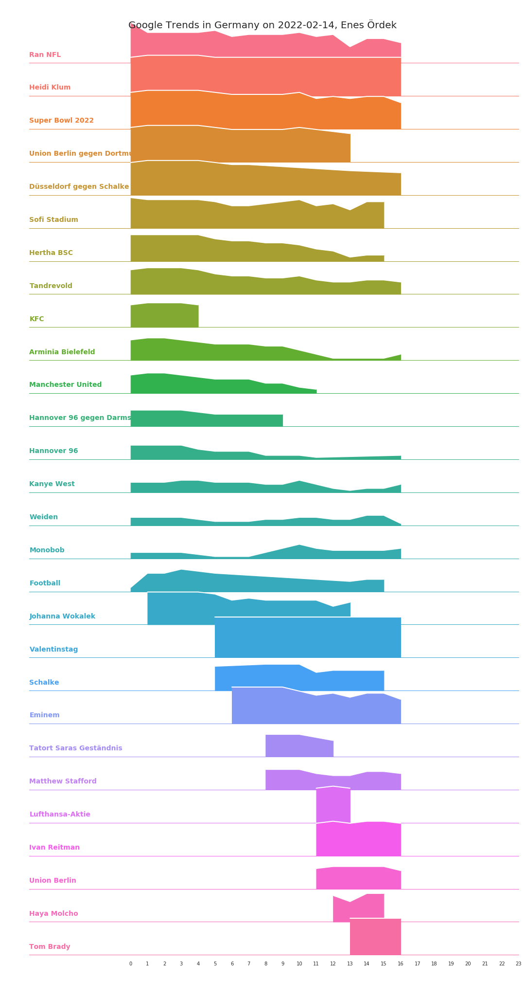
I wanted to build similar visualizations on a daily basis. I want to find out what moves people in Germany throughout the day. And here is already the result! Today is the 2022-02-14 and in the following diagram you can see today’s trends (until 4pm). The X-axis stands for the hour of the day.
But that is not all. I have generated all daily trends since 2022-01-22 as well and have shared them here: https://share.enesordek.com/google-trends/
Have fun looking around!
The most interesting finding from the visualization is that I can’t do much with the search queries. Thematically, the terms are very contrary to my areas of interest. There are a lot of search terms for “DSDS”, “Tatort” or “Dschungelcamp”. Countless personal names that I don’t know. Probably participants of such shows? I don’t know. There is also a lot of soccer and some news topics. It is interesting to see what moves my fellow citizens. It’s interesting to see how one’s own relationship is with these trends.
I will occasionally update the content of the share folder and further development is planned. I would like to develop a Twitter bot in which such interesting graphs are shared from time to time. What would the weekly graph look like? What would the monthly one look like? Is it possible to answer sociological questions with this data?